Still Life – Found Objects
Still life photography is a development sparked from still life painting, which came about in the 17th century. Famous painters such as Frans Snyders is an example of an artist who used objects such as food, wine, dead animals and flowers in their paintings. Still life is the use of objects/anything non-living within a photograph/painting/drawing. Still life photography has grown rapidly since, as photographers now have the power to photograph anything they like. André Kertész is known for his different compositions during the 1920s ad 30s. ‘Fork’ is one of his most famous photographs.

Research
Lucy Heath
‘Capture by Lucy’ is a multi award winning lifestyle blog created in 2012 by Lucy Heath, a natural light commercial photographer. I am particularly focusing on her ‘Prop Shop’ project, as she uses vintage and old fashioned objects as subjects for her photographs. Looking at the photographs below, she has used pot ornaments and kitchenware as well as a decorative flower. I like the theme of vintage items, creating a nostalgic interpretation of a 1970’s domestic lifestyle. The three photographs all present diverse compositions, but my favourite is the last one which displays four objects. I like the way she has arranged the kitchenware and used a slight shallow depth of field.


Kessels Krammer
‘In almost every picture’
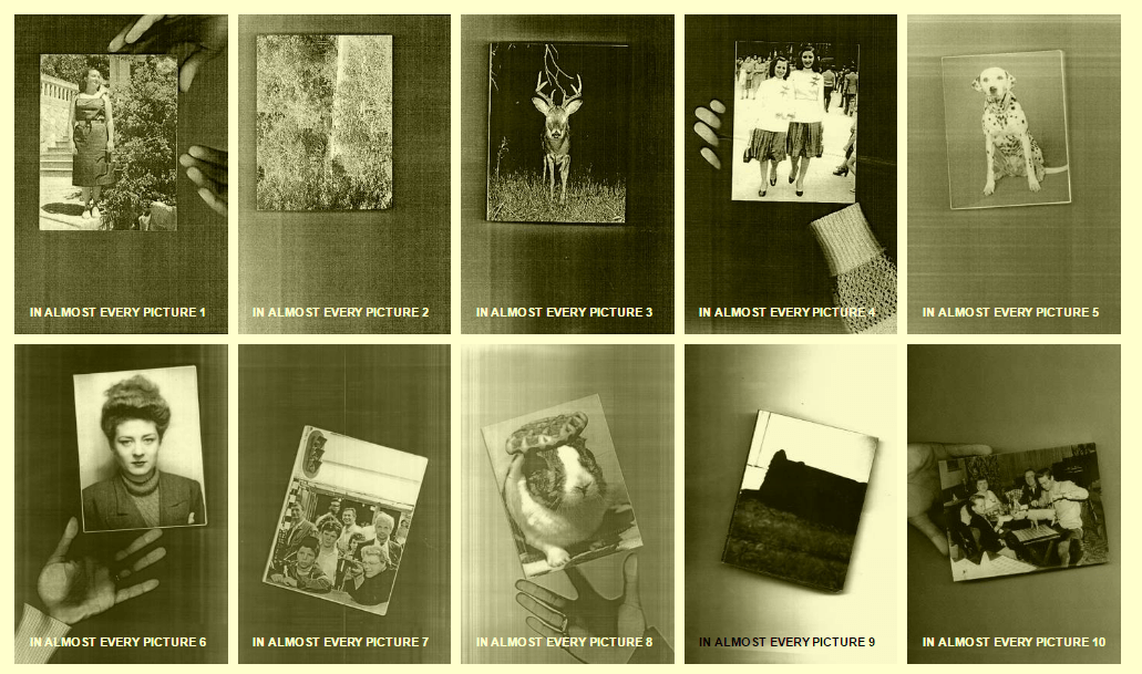
KesselsKramer is an independent, communications agency in Amsterdam, London and Los Angeles. 50 people within 10 different nationalities work for the company. In this project, people found and collected old photographs to create a series of images, which are described as ‘unpredictable’.
Stephen Gill
“Stephen Gill has learnt this: to haunt the places that haunt him. His photo-accumulations demonstrate a tender vision factored out of experience; alert, watchful, not overeager, wary of that mendacious conceit, ‘closure’. There is always flow, momentum, the sense of a man passing through a place that delights him. A sense of stepping down, immediate engagement, politic exchange. Then he remounts the bicycle and away. Loving retrievals, like a letter to a friend, never possession… What I like about Stephen Gill is that he has learnt to give us only as much as we need, the bones of the bones of the bones…” Iain Sinclair
Stephen Gill created a series of photographs as part of a project named ‘Off Ground’ where he collected stones and rubble from the aftermath of the Hackney riots. What I can take from his photographs is the stylistic approach he has taken. By this, I mean the use of a plain white background (presumably in a high key lighting studio) with one object as a subject. Gill uses a lot of blankness around his objects. He has clearly thought about the way his has lit the stones and concrete to emphasize the textures.

Philatelist May – Stamp collectors
“In a world dominated by electronic communications, the only postage stamp likely to cross a child’s line of vision these days might be affixed to a birthday card from a relative. And usually, the stamp goes unnoticed. Yet these tiny bits of sticky-backed art are so much more than charming relics of a bygone era.” – Barb Valentin (website here)
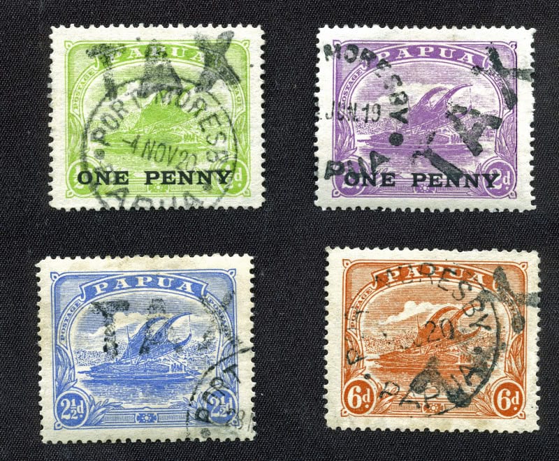
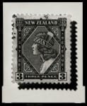
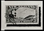
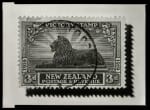
Casey Moore
https://www.youtube.com/watch?v=a-vxTLLbzEA
Casey Moore had an idea of enlarging stamps to identify and study them in more detail. His motivation came from his Grandfather as he was a well known philatelist. He designed the iconic Kiwi stamp from the 1935 2nd pictorial series in New Zealand. He enjoyed the craftsmanship of the stamps and wanted to appreciate the art work within them. His prints are all in black and white and have harsh shadows surrounding them. The stamps therefore are bolder on the plain, grey background. The shadow also emphasizes the zig-zag edges creating a sense of movement within line.
‘5p Drawers’
My Contact Sheet

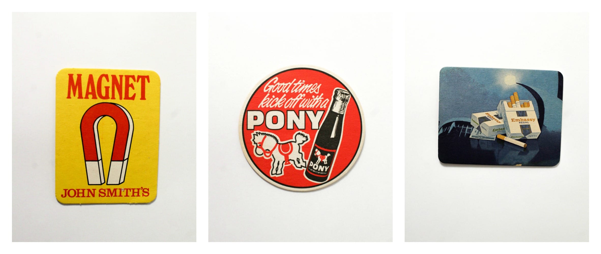
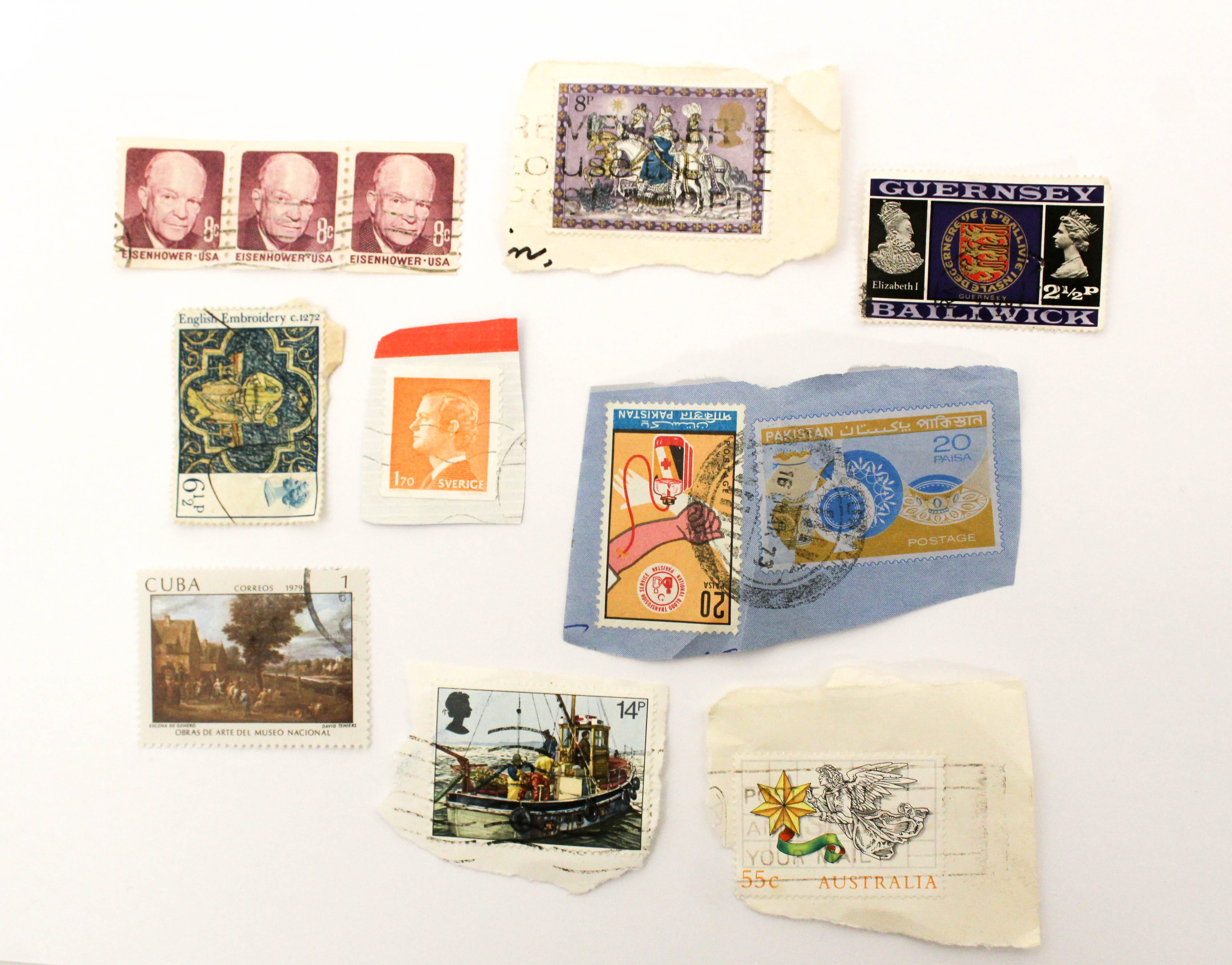
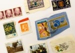
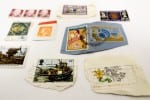
For my still life project, my found objects are what I collected in charity and vintage shops. I managed to find the stamps and beer mats in a chest of vintage drawers that all had ‘5p’ written on them in small writing. There were other drawers that contained marbles, thread, post cards and other small things. Kessel Krammer’s project had a similar theme, as they collected nostalgic images. I wanted to portray a diverse range of stamps with different prices, locations and images. I also liked the look of the coasters as they represent the lifestyle people used to have in pubs, specifically the cigarette one.
Experimentation
Evaluation – ‘5p Coasters’
As one possibility for a final piece, I placed together the three coasters as a side-by-side montage. I have placed the two rectangular subject photographs on the edges, leaving the circular coaster to stand out in the middle. There is a clear theme of primary colours, which I chose to enhance and saturate to exaggerate the bold colours. I did this in post-production by increasing the vibrancy and saturation. These photos were shot between 20-30mm. I used my bathroom wall as a studio, however I needed the exposure to be even higher, even in a well-lit setting. I had the f number (Aperture) set at 6.3 and the shutter speed was 1/125. In LightRoom, I edited the images to expose them even more, making the white areas stand out more. I increased the highlights and decreased the shadows to make the coasters more extravagant.
Using Depth of Field
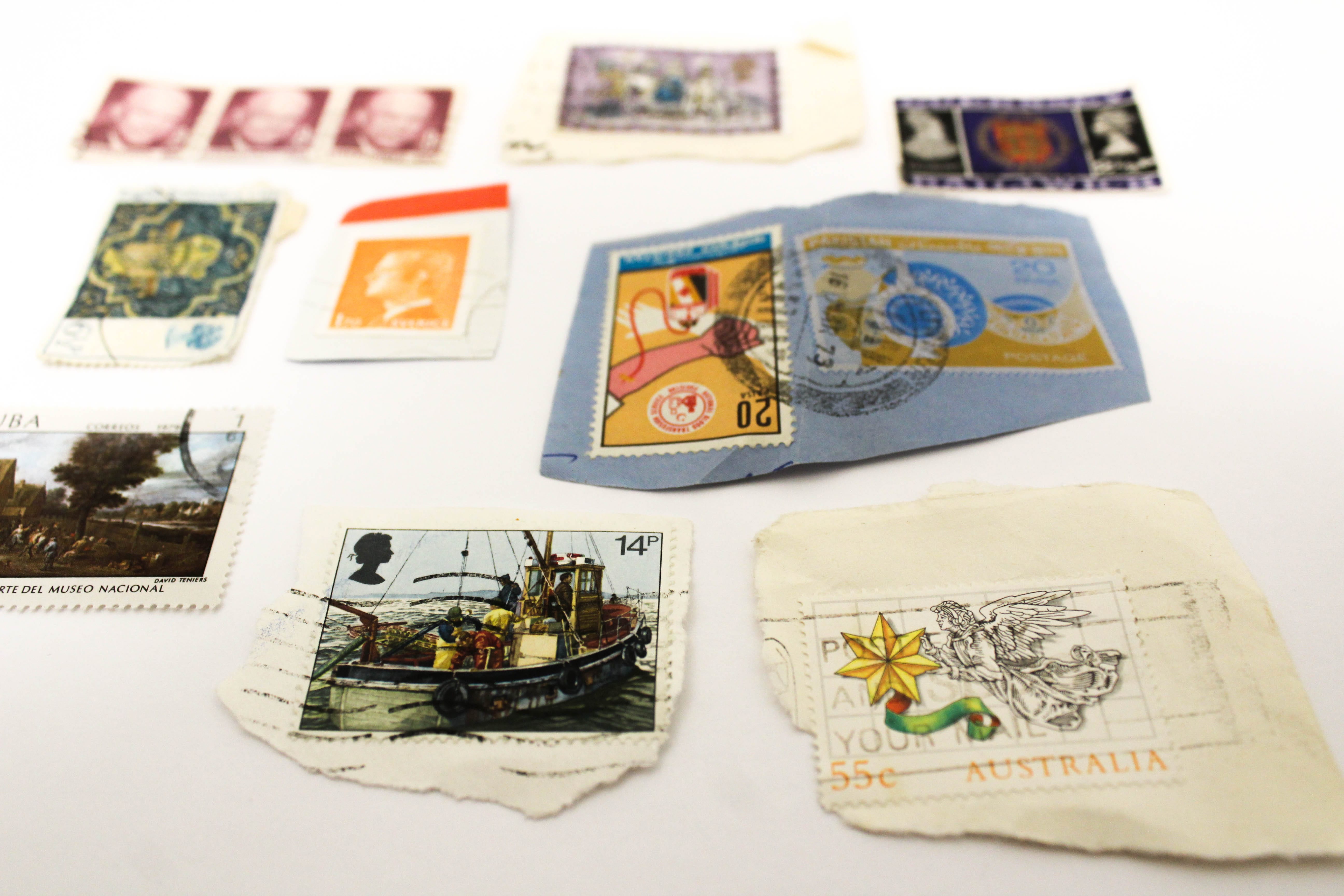
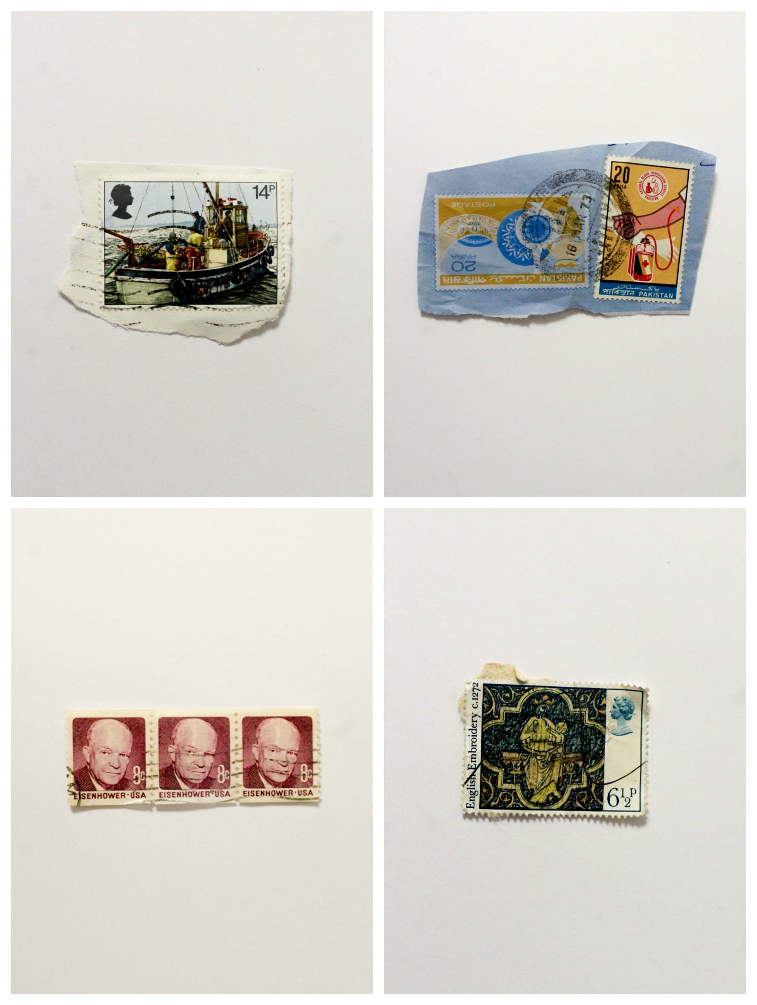
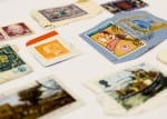
Below are 6 photographs using depth of field. I arranged the stamps in order to take photos from different angles. I focused on a different part of the photo each time, concentrating on one stamp.
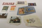
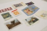
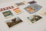
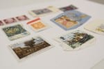
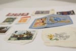
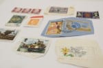
ISO 800, f5, 1/50.
Evaluation
Using depth of field in some photographs allowed me to create some different compositions. I wanted to capture the stamps all together, as well as photographing them individually. On my camera, I used a technique where I could zoom in on a certain sector to focus on a paticular part. In the photograph above, I chose to focus on the 14p stamp with the boat. This therefore is the main subject focus of the image. I edited the photograph above in LightRoom by increasing the exposure, white areas and highlights to take away the dull grey tone. I slightly increased the contrast and decreased the shadows to make the colours of the stamps bolder.
POV
ISO 800, f5, 1/50.
Evaluation
By photographing all of the stamps together, I was able to show the diverse range of stamps I had found. They are all from different decades and locations with different prices. I quite find the ones with the torn edges aesthetically pleasing, as they portray a ‘worn’ look, emphasising that the stamps are old. I also like the different colours and tones. There are some which are subtle (colours such as cream and brown) and others which are bright (oranges, blues, reds). Thus, there is juxtaposition within the collection of stamps.
Evaluation
Above, I edited 4 images together into a collage. For my final images, I was steering towards composing together 3 individual stamps, however, I thought it wasn’t interesting enough. I liked photographing each stamp separately because it shows how unique each one is. I cropped all of these photos in LightRoom so that the stamps were very central – identical in position. I particularly like the shadow that is showing underneath the stamps, therefore I increased she shadows to amplify them. These photographs are similar to Stephen Gill’s as they use a similar format and composition. There is one object that is focused on so that the audience is forced to look at the detail of each stamp.
Final Images
Evaluation
My final 3 images all include a montage of stamps but from different angles with different focuses. I liked these photos more than the individual stamp photographs as there was too much spacing around the stamps, making them look isolated and boring. By taking photos of them all together, you can view the diversity of stamps I found and the range of colours and types. I also liked the use of depth of field, as photographing one stamp is difficult to apply depth of field to. The images overall remind me of a time travel or an abundance of people’s messages sent all over the world. The use of traditional letter writing has died in today’s world of technology, which makes the artwork of these stamps seem even more aesthetic and unique.