Portrait Photography
Strangers
Shea Glover – ‘You’re Beautiful’
What I like about this project is that the photographer focuses her attention on people’s reactions, capturing facial expressions and emotions in an unexpected way. By videoing her subjects, she has been able to create freeze frame photographs of a ‘before and after’ effect to show the difference in facial expressions. By using communication in a photo shoot involving strangers, it has taught me that building a rapport is important to gain something from strangers. By speaking, she has been able to capture amazing and beautiful responses from each individual she has found.
Stranger Portraits
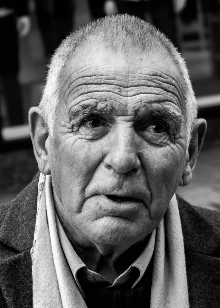
For the stranger photographs, I worked a long side Louie, as we felt that collaboratively working together would benefit our chances of getting strangers to pose for us and that it would build our confidence. We focused on older men as subjects as they seemed to pose more interestingly. Both of these men above seemed to have no expression when we asked to take the photo – neither smiled or frowned. The photographs captured natural expressions within both of their faces.
Stranger Portrait Evaluation
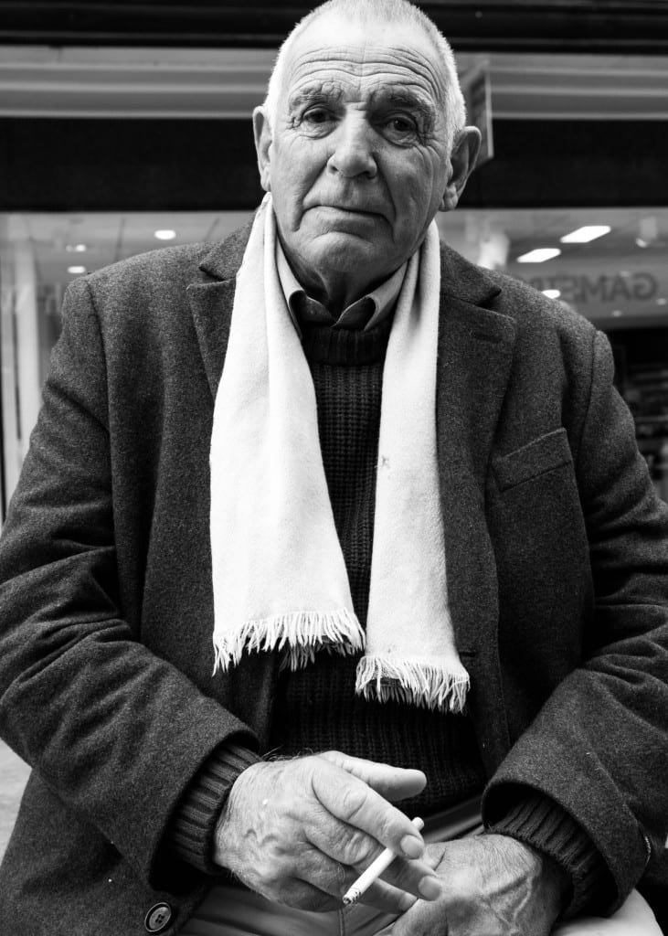
Settings: ISO 100, 28mm, f5.0, 1/60
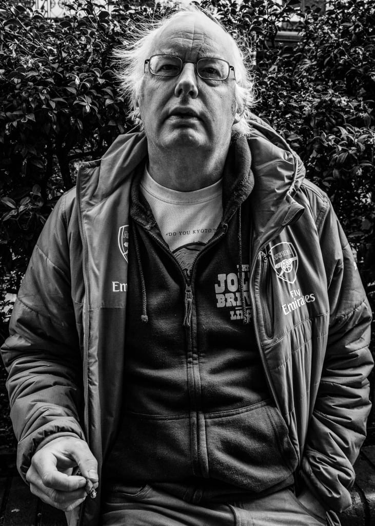
Out of my edited images, I chose this one as my final stranger portrait photograph. I captioned the photograph ‘The man with yellow scarf” even though you cannot identify this due to the black and white effect. He stood out to me when I was looking for people in the street as he looked quite sad but at the same time satisfied with his daily lifestyle. He looked as if he sat there regularly to smoke or take a break. Rather than following my artist research into capturing emotion and response, I quite liked the look of this man without saying anything at all. He sat there in his own way which I thought looked natural and beautiful in itself. To edit this photograph, I used LightRoom to first crop and straighten it so he is facing onward towards the camera. I took it at a slight low vantage point. I wanted the contrast to be quite high to enhance the shadows among the highlights in order to define his wrinkles and body features. The cigarette adds to the photo as a whole as it may open up interpretations for the audience to how long he has been smoking for etc. I used my 20-55mm lens to allow slight depth of field, which is shown in the photograph. If I could improve this, I would probably make the background even more out of focus to intensify the man as the subject.
Greg Gorman
Gorman specialises in celebrity American portraiture photography – particularly commercial and fashion photography. Gorman also concentrates a lot on nude photography, using nude women and men. His black and white photos often enhance and define parts of the body, for example, the shadows and lines within a man’s body (muscles, six pack, jaw line). I liked the idea of using harsh light to contrast with shadows, to define and emboss features within my subjects face. His photographs are very much for commercial and professional use.
Someone I know
Someone I Know and Self Portrait Evaluation
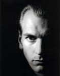
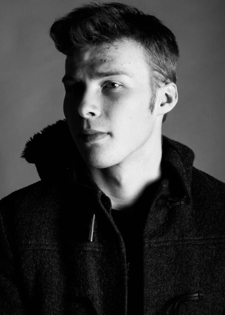
Within the high key lighting studio, using a grey back drop, I photographed my subjects using a fixed 50mm lens. Before taking any photographs, within the group, we used a grey card to allow adjustment to the white balance in post production. This particular photo was set to ISO 100 to allow minimal grain. The f number (aperture) was measured at f8. Finally, the shutter speed was 1/250. By linking the studio lights to the camera via a hot shoe, we were able to create a flash, therefore I put the ‘flash’ setting on within the camera. When trying out different apertures, I changed the stops on the lights from 1-5 to see what difference it made. Stop 3 seemed to work best as it wasn’t too bright, but not too dull. To create this shadow effect, I used only one light to create a flash, leaving the left side of the face in the dark. To start with, the right light was directly facing my subject. To make the shadow harsher, I moved it round to the side of my subject. In post-production (using Light Room), I firstly made the image desaturated. I wanted the contrast to be quite high similar to Gorgon’s work style, therefore I increased the highlights and decreased the shadows. This worked well in conjunction with a high contrast, making the shadows more vibrant and consequently adding definition to my model’s facial features. I felt that by making my subject sit to the side slightly, the difference between the highlights and shadows would be more obvious to the eye. The bright light hitting the subjects side of the face/body brings out the lines and creases, making my photo more textured. I also improved this by adjusting the clarity in Light Room.
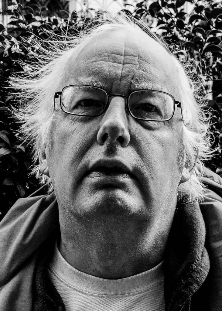
Shadows were clearly an important feature of my portrait images, which leads me to a discussion about the use of shadows on male subjects rather than female. Comparing my photograph of ‘someone I know’ to my self portrait, the main difference is the angle the subject is at and the tones. It is very rare to see a female subject with the use of shadowing the face, which may connote that males use shadows to imply dominance and mystery. Female faces tend to be exposed to the camera as they (especially in fashion and media) are more inclined to show their face and beauty. It can be argued that by using shadows on a male subject, it creates a sense of unknown and attention to one side of the face. Looking at my self portrait, I am facing forwards in bright day light, exposing my full facial features without the use of any shadows. There is a nice use of depth of field within my photograph as I am outdoors. This allows the natural light and surroundings to enhance myself, making me bright and clear, unlike Louie in the studio where it is dark. My self portrait comes across more natural compared to the ones in the studio as it was captured in the moment as the wind was blowing. The studio incorporates more posing and non realistic portrayals of people, as the lighting it set up to create a certain look.
Self Portrait


